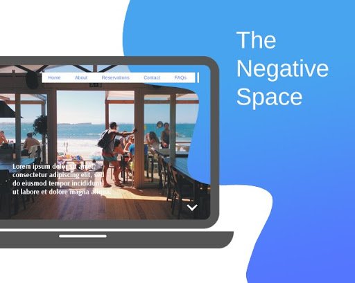
Websites consist of several features and elements like columns, buttons, icons, media, content, graphics, etc. that exist in the same space. Web designing focuses on assembling and arranging all these visual features in such a way that it efficiently communicates the message and purpose.
If the website is full of all these elements, it can also portray chaos, leaving the user confused and irritated. Therefore, negative space holds significant importance in web design. Often termed as ‘white space,’ negative space is everything other than the focal point or subject of the website design. It can also be called the empty area within the subject that adds air and space in the design.
Yor Wish: Make Money “$200” in an Hour with these 2 Genuine Ways
Common Types of Negative Space
Negative space defocuses the cluttering of the website and adds a hollow and empty feeling. There is no single way of it, and various types of negative space are proof of it. The following common types of negative space help you understand it in a better way.
Micro and Macro Negative Space
It is the small space between the design elements, such as the space between the lines or content. Contrarily, macro negative space is the large space between the design elements. It is the left out or empty area in the icons, content blocks, or layout.
Active and Passive Negative Space
Active negative space is the one that focuses on the content of the website and directs the attention of users towards it. On the other hand, passive negative space is the one that focuses on the outlook of the website through symmetrical balance.
This article will highlight the role of negative space in boosting the design of a website.
Top 6 Ways Negative Space Makes Website Design Attractive
Competition in every field of life has increased significantly. The websites are also on the line, which makes their owners pay more attention to designing. Unique and attractive website design can catch not only the attention of users but also increases its popularity. The use of negative space is also playing a pivotal role in boosting attraction and popularity. Therefore, it is a rising trend in the web designing industry of the United Arab Emirates.
Below mentioned are the keyways negative space makes the design of a website more attractive.
1. Adds Breaks in Page
A website can be full of content or graphics, which minimizes the user’s ability to grab the point of their need. The use of negative space in the website design adds little breaks in the presented information and visuals. However, it also requires a little symmetry, which only professionals can create. Due to this, most of the website owners hire website design Dubai based companies and ensure user-friendly and attractive designs, which increases their website traffic and popularity.
2. Focuses on the Central Message
Suppose you have a website that requires sharing loads of content. It can be news, educational guides, or tutorials, etc. Too much content will confuse the site users, and they may close it after getting disappointed. This is where negative space comes to the rescue as it highlights the central message and helps the users explore what they are looking for.
3. Boosts Sophistication
People of this era value sophistication a lot. They also like to see it in the design of a website that evokes elements of simplicity and discipline. Negative space is the website design trend that significantly supports this cause. It adds value to the visual presentation of the website and allows the subconscious mind of the users to process it.
4. Directs Flow of Page
The website owners want the users to process the displayed information in the way they want. They do not want the readers to reach the bottom or move to the next pages after looking at the content displayed in the middle. They want to control the user’s attention, which is only possible using negative space. It helps create a certain flow of information, which can direct the flow of page for the users.
5. Pops Out the Visual Elements
One of the most important ways negative space makes a website design more attractive is by making the visual elements pop out. Most of the websites use the art form of optical illusion to please the users’ aesthetic sense and catch their attention. The use of white space makes it even compelling, though it does not always have to be white.
6. Supports Minimalism
Minimalism is one of the most sought out design philosophy in this advanced era. Suppose you own a website for design that focuses on minimal presentation. You can only impress the users if your website portrays the same. So, negative space is a highly recommended design strategy that serves the purpose. You can hire professionals from Spiral Click a website design company in Dubai, and get your website redesigned following the principles of negative space.
Use the negative space in your website design to stand out!
Experimenting with your website design can make the users anticipate the change. The users will be eager to visit your website. So, you need to redesign your website once in a while. This time, you can use the negative space in your website design to stand out and impress your users. If you lack the required skills, consult the experts now and decide about your redesigning strategies.

